
I have been thinking a lot about visual grammar lately, partly because I have been reading Christian Leborg's Visual Grammar, and partly because building native Mac software forces you to confront something web apps can often avoid for a long time: every visual decision teaches the user how the product works.
A button is not just a button. A toolbar is not just a place to dump actions. A popover is not just a smaller window. Spacing, contrast, grouping, rhythm, alignment, movement, hierarchy, and repetition all say something before the interface says anything with words.
That can sound abstract until you are building a real app and trying to decide where a control belongs. If two controls are close together, users assume they are related. If a button is visually dominant, users assume it matters more. If a panel opens from the wrong place, the app feels confused. If the same action looks different in three places, the user has to do the app's thinking for it.
Visual grammar is useful because it gives language to something that is usually argued through taste. Form, size, color, direction, balance, symmetry, repetition, variation, movement. These are not decorative trivia. They are the primitives that decide whether an interface feels understandable before anyone has read a line of help text.
Reading Controls Are Product Controls
One of the more deliberate choices in Telescopo Markdown Studio is that reading controls are not buried deep in a settings screen.
Most document apps treat theme, font, width, zoom, contrast, and related controls as preferences. That makes sense if you think of them as configuration. I do not think that is what they are. When you are reading a long Markdown document, reviewing code blocks, looking at Mermaid diagrams, comparing source and preview, or exporting a PDF, those controls are part of the work itself. They change how the document is perceived, navigated, and understood.
That is why Telescopo's reader toolbar became such an important part of the app. It keeps the controls that shape the reading experience close to the document. Themes apply immediately. Font and width changes are visible while you are reading. Navigator, search, zoom, preview behavior, and document actions all have to live in a structure that feels sensible from context alone.
This was not a case where the interface was wrong and then I fixed it. It was something I intentionally designed from the start, but there was not a perfect design pattern to copy. I wanted the app to respect the core principles of visual grammar while also making immersive, dynamic customization a real part of the product's identity. That meant the interface had to teach the user that these controls were not afterthoughts. They were part of how the app works.
Native Design Is Behavior
The mistake I keep seeing in software is treating design like polish applied at the end. Build the features, wire the buttons, then make it look nicer.
That is backwards, especially in a native Mac app. Design is part of the behavior. The interface has to explain what is possible, what is active, what is secondary, what belongs together, and what the user can safely ignore. Good design reduces the amount of explanation the product needs.
This is why Apple's Human Interface Guidelines still matter to me. Not because every app should look identical, and not because guidelines are a substitute for taste. They matter because Mac users already bring years of learned expectations into every window they open. Toolbars, menus, tabs, popovers, shortcuts, system colors, and settings all carry meaning before your app adds anything new.
Apple's newer software design direction says something similar in a different way. When Apple introduced its 2025 cross-platform design update, the interesting part to me was not novelty for novelty's sake. It was the emphasis on software feeling familiar while also becoming more expressive, with controls, navigation, and materials responding to content and context. That is the part worth paying attention to. The best platform design is not merely visual style. It is hardware, software, input, motion, typography, and feedback working together so the product feels like it belongs on the machine.
For Bad Command AI apps, that is the bar I care about. I do not want them to feel like generic software that happens to run on a Mac. I want them to feel native, local, and specific to the Mac.
From Viewer to Studio
The hardest version of this problem showed up when Telescopo moved from Markdown Viewer into Markdown Studio.
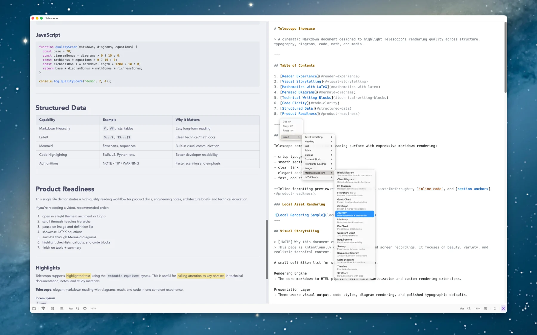
A focused Markdown viewer has a simpler grammar. Open a document, read it, search it, adjust the reading experience, export it, and move on. Markdown Studio changed the shape of the app because writing entered the room. Now the interface had to support source Markdown, rendered preview, insert actions, templates, split editing, diagrams, math, document navigation, PDF export, Live Monitoring, iCloud Sync, and on-device AI without making the whole thing feel like an IDE.
The answer was not to hide everything. The answer was to make the relationships clearer.
Document actions belong together because they live in the user's mental model of the file: opening, refreshing, monitoring, exporting, syncing, and handing work off. Reader controls belong together because they shape perception: theme, font, width, zoom, search, navigator, and preview behavior. Studio controls belong in the writing flow because they support creation: templates, formatting, insert actions, split preview, Mermaid, LaTeX, tables, callouts, and reusable document structure.
Once you think this way, small details stop being small. A popover opening from the right place matters. Icon order matters. Footer actions inside a popover matter. The difference between an explanatory note and a primary action matters. If the interface can make those relationships visible, the user does not have to keep rebuilding the product model in their head.
Themes Are Not Skins
Telescopo now ships with 30 handcrafted themes, and they are not just color swaps.
Each theme has to work across document text, headings, links, code blocks, syntax highlighting, Mermaid diagrams, LaTeX math, tables, callouts, editor surfaces, preview surfaces, toolbar materials, selected states, muted labels, and export output. A theme can look good in one screenshot and still fail the moment a long code block, a dense table, or a diagram appears. That is where theme design becomes product engineering.
The code syntax colors are a good example. You cannot just choose colors that look attractive in isolation. They have to hold up against the document background, preserve enough contrast, keep primary and secondary information distinct, and still feel like they belong to the theme. The same is true of primary and secondary UI colors. If they are too close, hierarchy collapses. If they fight each other, the app gets loud. If they are technically readable but visually unpleasant, the document becomes work to look at.
This is where visual grammar becomes practical. Contrast tells the user what is different. Scale tells the user what matters. Repetition tells the user what belongs together. Variation tells the user when something has changed. The Nielsen Norman Group's visual design principles frame these ideas as usability concerns, which is exactly right. Users scan before they read. They read relationships before they read instructions.
Mermaid Made the Problem Obvious
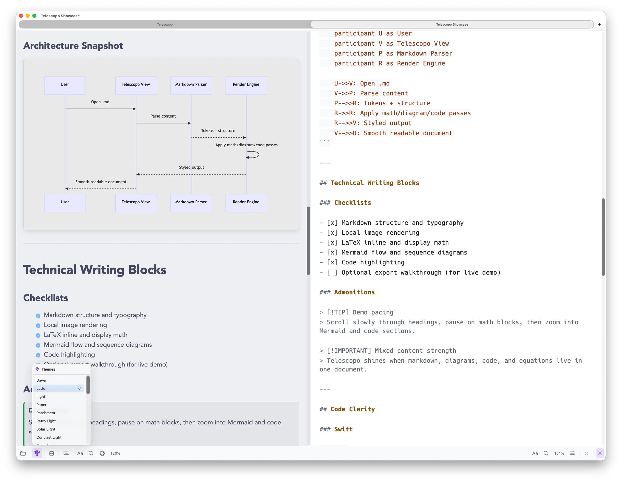
Mermaid diagrams have been one of the most difficult and useful examples of this.
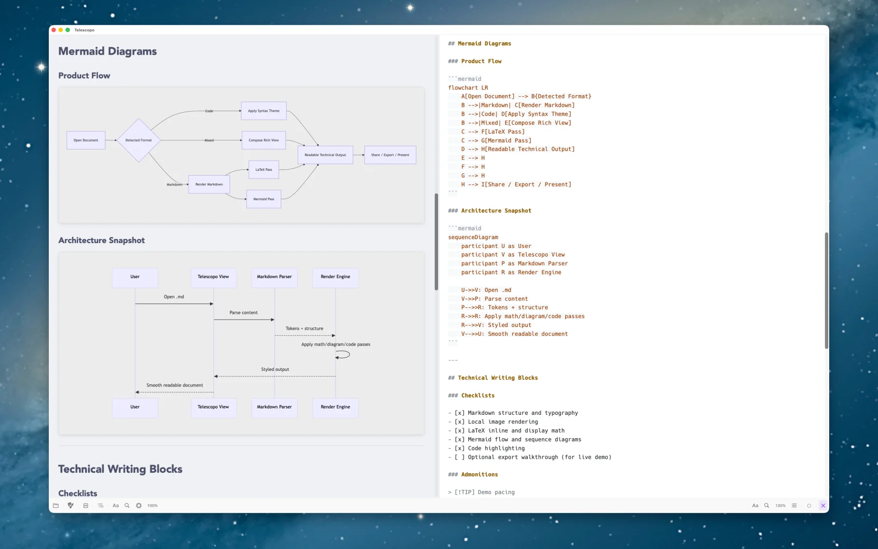
Markdown text is one thing. Code highlighting is another. But a diagram has its own figure and ground. It has lines, fills, labels, arrows, clusters, shapes, and sometimes generated colors that were not chosen with your app's theme in mind. A diagram that looks fine on a light background can become muddy on a dark background. A diagram that survives dark mode can still fail when exported. A diagram that is readable for one user can be uncomfortable or inaccessible for another.
We had to handle light and dark backgrounds separately, use careful inversion where it helped, and eventually add a user-adjustable diagram background because the right answer was not always one global rule. That work made the app more beautiful, but it also made it more accessible. Once you are thinking seriously about diagram contrast, you start seeing the larger opportunity to support high contrast properly.
That led into Telescopo's native high contrast support and two dedicated high contrast themes, in addition to robust support for macOS light and dark modes. This is exactly the kind of product detail that sounds small until you use the app with a real document. The difference between a diagram that technically rendered and a diagram that can actually be read is not polish. It is the product.
Personality Needs Structure
I like software with personality. Telescopo has colorful themes, animated themes, a rich welcome experience, and visual choices that are more expressive than a plain gray document utility. But personality only works when the structure underneath it is disciplined.
If the control groups are unclear, personality becomes noise. If the toolbar is visually exciting but functionally confusing, it fails. If a theme looks dramatic but makes code harder to read, it is not a good theme. If a popover is beautiful but does not make the next action obvious, the beauty is not doing useful work.
That is the balance I keep trying to find with Telescopo: powerful enough for serious Markdown documents, expressive enough to feel alive, and structured enough that the app does not make the user do unnecessary interpretation.
The Point
Reading Visual Grammar did not make me want to make software more decorative. It made me want to make software more intentional.
The best interfaces are not quiet because nothing is happening. They are quiet because the relationships are clear. The user knows where they are, what changed, what matters, and what to do next.
That is the kind of software I want to build at Bad Command AI. Native. Fast. Local. Thoughtful. A little opinionated. Useful enough for real work, but designed carefully enough that using it does not feel like work.
Because visual grammar is not just for posters, books, or logos. It is for every window someone opens and immediately decides whether the app belongs on their Mac.
If you care about Markdown tools that treat reading, writing, diagrams, themes, and export as part of the same native Mac experience, Telescopo Markdown Studio is available at telescopo.app.
References: Christian Leborg's Visual Grammar, Apple's Human Interface Guidelines, Apple's 2025 software design announcement, Nielsen Norman Group's visual design principles, and Telescopo Markdown Studio.